Tuesday, February 12, 2013

Wednesday, January 16, 2013

New Drawing!


More drawings!
http://cwdrawings.blogspot.com/


All drawings reasonable priced.
Email
chadwbecks@gmail.com
for pricing

Wednesday, January 02, 2013

AMULET BOOKS WINS NEW MIDDLE GRADE BOOK SERIES


The news of our the new series Susan Van Metre and Charlie Kochman acquired by bestselling author Jon Scieszka broke over the holiday week. Our official statement is below. Publishers Weekly ran an exclusive in the 12/24 print magazine, which is attached for you to forward to your accounts that can use the news.  Please note that the series will not be published until fall 2014. We needed to release the news now as there were other publishers who bid on the series so waiting too long would allow the news to be broken by another source as people were speculating. It’s very exciting to have Jon on board.

AMULET BOOKS WINS NEW MIDDLE GRADE BOOK SERIES FROM BESTSELLING AUTHOR JON SCIESZKA IN A HEATED 6-WAY AUCTION

Senior Vice President and Publisher Susan Van Metre and Editorial Director Charles Kochman at ABRAMS Amulet Books imprint beat out five other children’s publishers for the first six books in a new illustrated middle grade series by bestselling author Jon Scieszka, the nation’s first National Ambassador of Children’s literature. Titled Frank Einstein, Kid Scientist and illustrated by Brian Biggs, the series is about a budding scientist who battles an evil genius with the help of two well-meaning but imperfect robots that he invents. The first book will appear in fall 2014. Scieszka’s longtime agent Steven Malk at Writers House orchestrated the deal. Amulet Books plans an extensive marketing and publicity campaign for the launch.

Jon Scieszka always wanted to be a kid science genius. The closest he got was winning a green "Participant" ribbon at his fourth grade Science Fair and dressing up one Halloween as a bloody Albert Einstein. Scieszka studied pre-med in college. He taught elementary school, including second grade science, in New York City for ten years.  For over twenty years, he has been a children's book writer, and is the author of The True Story of 3 Little Pigs!, The Stinky Cheese Man, the Time Warp Trio series, Math Curse, Science Verse, the Trucktown series, the Spaceheadz series, and more. In 2008, Scieszka was named the nation's first National Ambassador of Young People's Literature by the Library of Congress and the Children's Book Council.  He is also the founder of the web-based literacy initiative for boys called Guys Read, and is the editor of the Guys Read Library of Great Reading series.

Founded by Harry N. Abrams in 1949, ABRAMS was the first company in the United States to specialize in the creation and distribution of art and illustrated books. Now a subsidiary of La Martinière Groupe, the company publishes visually stunning illustrated books in the areas of art, photography, cooking, interior and garden design, craft, architecture, entertainment, fashion, sports, pop culture, as well as children's books and general interest titles. The company's imprints include Abrams, Abrams ComicArts, Abrams Image, Abrams Books for Young Readers, Amulet Books, Abrams Appleseed, Stewart, Tabori & Chang, and STC Craft/Melanie Falick Books. Abrams also distributes books for The Vendome Press, Victoria & Albert Museum, Tate, Royal Academy of Arts, Booth-Clibborn Editions, Five Continents and others.
www.abramsbooks.com

Thursday, December 13, 2012

The Evolution of a NERDS book cover


"I imagine people will be surprised at how much work goes into this type of project. I'm surprised, and I participated in it!" —Ethen Beavers

The following shows the process Ethen and I went through working on the cover for Michael Buckley's latest series, NERDS. I wish I could have better descriptions but I don't want to give away all my secrets.

Step one find an Illustrator.
To find the perfect illustrator I teamed up with Michael and headed down to our local comic store, Rocketship  (sadly, now closed) on a cold January afternoon. We shifted through comics and graphic novels , compiling a list of ten names that we would present to our editor Susan Van Metre. In the end Ethen Beavers was the nerd for us. I tracked Ethen down by leaving a message on his art message board since all other searches came up flat. He responded which was a welcomed surprise.

I then sent him Michael's 2nd draft manuscript and a brief summary.

NERDS book description:
A secret spy ring of nerdy elementary school misfits
Combining all the excitement of international espionage and all the awkwardness of elementary school, NERDS, featuring a group of unpopular students who run a spy network from inside their school, hits the mark. With the help of cutting-edge science, their nerdy qualities are enhanced and transformed into incredible abilities! They battle the Hyena, a former junior beauty pageant contestant turned assassin, and an array of James Bond–style villains, each with an evil plan more diabolical and more ridiculous than the last.


Step two begin sketch phase

Ethen's first sketch


My first alternate compositional sketch. The idea was to introduce the all the characters.


Here the idea is the same but a little more realized. We added braces in the type. I add to a nerdy style as well as to highlight the main characters nerdy quality. This would be repeated through out the series. Only
there was something still not quite working.


We where forgetting the Spy angle to the NERDS story.
here are some additional sketches working out new compositions


The idea of and official seal came up.
Finally a font was chosen


Here we begin to work out color and how it will be used throughout a 6 book series


Next how to treat the type. I wanted a techie feel to the type as seen below.


Final type

But the seal still is working correctly. So we tried to nerd that up as well.
In the end it proved to be to much.


At last the color and composition is worked out.
Only something is still not working.


Again we needed more spy imagery. So we research James Bond and Mission Impossible imagery.
Ethen worked up these great sketches reworking the characters.


Ethen then combined the two ideas in to a final sketch


Then we took it to a cover meeting to see if we were on track.
Turns out we were!


Final art with out text.

Final Cover with text


Back cover design

Each book features a character. Book 1 features Jackson " Braceface" Jones, the new recruit. The fourteen pounds of metal in his mouth make him the team's go-to gadget guy!

One last bit a of business the CASE COVER! 

Did you know we designed the case covers for NERDS series with a different image than the jacket. I knew it you didn't. Who looks at the case cover anyway. GULP! I do.


Case Cover

The idea for the different case was to reveal the NERDS secret identities as normal kids. Apparently when they are not saving the world they also become fashion disasters.


Also in the NERDS series


About the book
Michael Buckley is at his comic best in this madcap new series sure to appeal to kids looking for a quick, exciting read.

Combining all the excitement of international espionage and all the awkwardness of elementary school, NERDS, featuring a group of unpopular students who run a spy network from inside their school, hits the mark. With the help of cutting-edge science, their nerdy qualities are enhanced and transformed into incredible abilities! They battle the Hyena, a former junior beauty pageant contestant turned assassin, and an array of James Bond–style villains, each with an evil plan more diabolical and more ridiculous than the last.

F&P level: V

Praise for NERDS
“An action-packed, tongue-in-cheek take on the world of superheroes and villains. The pacing is quick and the action is plentiful—kids will almost hear the sound effects as they read. NERDS brings a worthy message to the fore—that uncool kids can grow up to be anything but. Funny, clever, and thoroughly entertaining, this title should be popular.”
School Library Journal 

"The unique format of this book, combined with the imaginative and playful storyline, will appeal to many readers."
Children's Literature

About the author
Michael Buckley is the author of the New York Times bestselling series and Today Show Al Roker Book Club pick The Sisters Grimm. He has also written and developed shows for Nickelodeon, Disney, MTV Animation, the Sci- Fi Channel, the Discovery Channel, and VH1. He lives in Brooklyn with his wife, Alison, and son, Finn.


Thursday, December 06, 2012

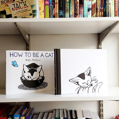
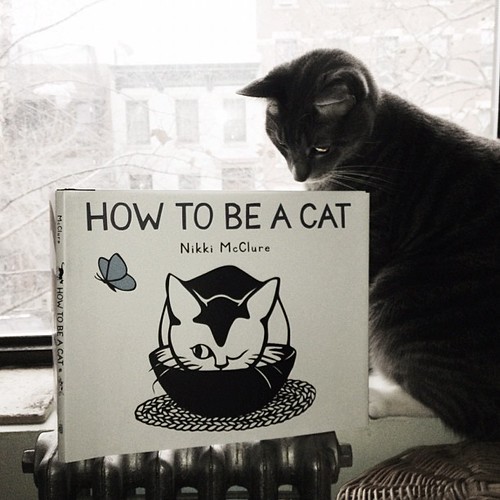
HOW TO BE A CAT @nikkimcclure Advances are in!! Jacket and Case design.

Kentucky the Cat seeks self betterment with @nikkimcclure HOW TO BE A CAT! @abramskids (SP 13)

Thursday, November 15, 2012

The Evolution of a Picture Book Cover, Starring JOHN BROWN


Illustrator and author John Hendrix posted the 'Anatomy of a Jacket' on his Blog Drawing on a Deadline. John discussed the process of making the jacket for his latest book JOHN BROWN:His Fight for Freedom. This entry is a follow-up to his but from the view of the art director. Let's begin.


Usually after most of the interior is underway, do I start asking the illustrator (in this case John Hendrix) to start sketching up cover ideas. Sometimes I will have something in mind that might work. This was not one of those times. I felt that what ever John might sketch up was going to be better than any suggestion I might have. But more importantly at this stage I feared that any direction might stifle his creative process.

So John began to sketch.


And from there he selected his best sketch


At first glance John's sketch was very impressive and exciting only was it right for the book? I waited a couple of days to see if it was still as exciting. After showing it to the editor Howard Reeves. His concerns echoed my own. That as beautiful of a drawing as it was, for a cover it was to stately and stiff for the book that it is. In addition the subtitle was of some concern "The Oath of Freedom" It leads you to believe that John Brown actually took an oath, which he he did not. Howard and John worked on subtitles that might better suit the story.

My direction to John was simple we need more motion/action. I wanted to feel John Brown's passion. I referred him to pieces from the interior that worked well and captured what I was trying to say.


So back to the drawing board.


This new sketch compositionally was better than the last, it definitely had action. I loved how the type was developing but now John Brown appeared to be crazy pants rather than a 'hero' . How where we to make him appear to be a 'hero'. At first this was a hard thing to do. mainly because of his beard. It made him look Joaquin Phoenix / Una bomber crazy. This had to change. I suggested thinking of Superman crossed with Moses.


We both seemed excited by this idea but would it work? John went out in search of reference.


John's next sketch was right on the nose. At this point we worked out a subtitle that better described John's Brown's story, " His Fight for Freedom"


Only one slight change. We needed a girl character. (See below)


Next John stopped by my office where we went over how the whole cover would look. Back cover, flaps, and spine. I wanted to utilize John's typography as much as possible. Type is not something to be place just on top of an illustration. Anything I might have done would look unnatural with his art. I try to make sure that type and illustration live together rather than fighting with each other. I had John work up type for the flaps and spine , well really the whole jacket.


Once the sketch was approved John set out to work on the final. He first looked over the entire book to remind himself of the general color structure. From here I wait until I see the final art. Below are John's studies and process of making the final art


The shield on the bottom of the art needed to be used on the title page as well, in different proportions, so he built all the elements of the cover individually and assembled them in Photoshop.


Once the bottom was assembled in place with the flaps and spine, He could lay in the art for the top. Here is the full piece, unobscured by the shield.


Finally the cover art was done. Next step add Jacket and Flap copy.


Here is the final front cover.

 For more about JOHN HENDRIX check out this cool interview.

Also Illustrated by John Hendrix
Nurse, Soldier, Spy
The Story of Sarah Edmonds, a Civil War Hero


Illustration © 2009 by John Hendrix.
Published by Abrams Books for Young Readers. New York.
Posted with permission of publisher. All rights reserved.