Two Weeks - Grizzly Bear from Gabe Askew on Vimeo.
Friday, August 28, 2009
Wednesday, August 26, 2009
Saturday, August 22, 2009
David Macaulay's TED talk
"David Macaulay's exploratory renderings of architectural marvels throughout history have captivated children and adults alike. With crystal clear drawings and insightful text, Macaulay takes his readers inside these structures, illuminating not just the engineering prowess of the builders, but also their daily lives -- from the rulers and engineers down to the peasants hauling the bricks.
http://www.ted.com/talks/david_macaulay_s_rome_antics.html
Among Macaulay's many awards is a Caldecott Medal for his book Black and White. He has produced an acclaimed 5 part PBS series (and companion book) Building Big, which reveals the engineering wonders of the biggest of the big. His classic work The Way Things Work (and its new edition, The New Way Things Work), was on the New York Times bestseller list for 50 weeks. He is an illustration instructor at his alma mater, the Rhode Island School of Design"
Labels:
RISD,
TED,
ted talk David Macaulay,
video
Thursday, August 20, 2009
STRUTS and FRETS Finished books are in!


New Author Jon Skovron makes some noise this November with
STRUTS & FRETS
http://strutsandfretsbook.com
THE MUSIC
http://strutsandfrets.jonnyskov.com/music.html
STRUTS & FRETS
http://strutsandfretsbook.com
THE MUSIC
http://strutsandfrets.jonnyskov.com/music.html
Are books dead?
www.youtube.com/qtv
"With the arrival of digital readers some in the book world are wondering if their industry will follow the music industry's lead of online content quickly becoming king over hard copy.
Chip Kidd weighs in on the subject. He's been called the "world's greatest book-jacket designer" and USA Today has labeled him "the closest thing to a rock star" in the world of book-cover design. Jian gets into Chip Kidd's craft as well. "
Labels:
Are books dead? Q TV,
Chip Kidd,
music videos,
you tube
Monday, August 17, 2009
Wednesday, August 12, 2009
NERDS! BOOKS ARE IN!
Check out my copy of NERDS. Fresh from the printer. I know . . . you're jealous. In a month it can be yours.
Monday, August 03, 2009
The Evolution of the 3-2-3 Detective Agency Cover


in The Disappearance of Dave Warthog
By Fiona Robinson
One of my favorite books on the Fall 2009 Amulet list is 3-2-3. I have talked about evolution Michael Buckley's NERDS in dept and will soon be posting about Lauren Myracles Luv Ya Bunches but right now its time to take a look at the evolution of the 3-2-3 cover design.
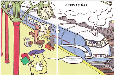
On the 3:23 Express to Whiska City, five unlikely friends meet and decide to form a detective agency. There is Jenny the wise donkey, Roger the gourmet dung beetle, Priscilla the theatrical penguin, Slingshot the hyperactive sloth, and Bluebell, the shy but brave rat. With little training but a lot of pluck, they set up shop in Whiska City and soon tackle their first mystery: a rash of disappearances linked to a pink poodle’s beauty salon.
A funny, clever detective story for young graphic novel fans!.
By Fiona Robinson
One of my favorite books on the Fall 2009 Amulet list is 3-2-3. I have talked about evolution Michael Buckley's NERDS in dept and will soon be posting about Lauren Myracles Luv Ya Bunches but right now its time to take a look at the evolution of the 3-2-3 cover design.
First a little bit about the book
Fast-paced, full-color, and divided into short, easy-to-read chapters, this is a wonderful graphic novel for younger readers, offering a seamless transition between picture books and novels.On the 3:23 Express to Whiska City, five unlikely friends meet and decide to form a detective agency. There is Jenny the wise donkey, Roger the gourmet dung beetle, Priscilla the theatrical penguin, Slingshot the hyperactive sloth, and Bluebell, the shy but brave rat. With little training but a lot of pluck, they set up shop in Whiska City and soon tackle their first mystery: a rash of disappearances linked to a pink poodle’s beauty salon.
A funny, clever detective story for young graphic novel fans!.
 On one of Fiona's many enjoyable visits to our offices she dropped off these 2 pulp comics, AMAZING STORIES. Which I took some direct and indirect influence from. The trick was to introduce the characters in a pulp comic setting while remaining true to the Fiona's voice.
Here are three of our first attempts.

 We all loved the humor an wit of Fiona's characters along the spine but how to make the type work was still and issue.
In all three of the above the title type was a problem. No matter what we tried the design forced us to put the copy in a box which just didn't seem to work. Also, it became repetitive to show all five characters along the spine and in the main image. There were to many parts, to many things going on. Below is an attempt at simplifying the above ideas.

This direction seem to click at the time. We liked it enough to present it and the other ideas at our weekly cover meeting for discussion. The conversation in the meeting turned to a confusion over why the monkey was hypnotized and whether this was the image that was best for the book. We also talked about what was more important, introducing the characters or telling the audience that this is a pulp mystery graphic novel. At the moment we were displaying all these ideas yet nothing was working 100%. So we were sent back to the drawing board.
Almost a month went by before I was able to take another go at rethinking the design Luckily we were ahead on this book so I had time to waste. But more importantly time to step back and take another look from a far.
Knowing what we needed to be on the cover helped going forward.
1. Introduce the characters
2. Pulp comic design influence
3. Simple design/Iconic Image
4. Communicating that the book is a mystery.
5. Setting up a design for a possible series if needed.
On a rainy Thursday afternoon Fiona and I sat down in my dark office and I sketched this up while listening to Fiona's ideas.

We wanted to somehow keep the circle character drawings from the first cover comps. Can any one say BACK COVER?!

Fiona's Final cover art

Back cover hand drawn text
Paperback text
 Back cover hand drawn text
Hardcover text

Back cover text plus illustration
A needed graphic element hinting at a mystery and an important plot point. Final cover design.

A needed graphic element hinting at a mystery and an important plot point.
 Final cover design.
Final Hardcover with Flaps design

FIONA ROBINSON
About the author
Fiona Robinson is the author-illustrator of The Useful Moose: A Truthful, Moose-full Tale. Publishers Weekly praised her “flair for humor tinged with heart.” Her work has been honored by the Royal Academy of Arts and been featured in many gallery shows. She lives with her family in Brooklyn, New York.Available in two editions:
Paperback, and hardcover with jacket
SPECIFICATIONS FOR BOTH BOOKS:
80 pages, full color, 6 3⁄4 x 9 3⁄8"
PAPERBACK ISBN: 978-0-8109-7094-6
HARDCOVER ISBN: 978-0-8109-8489-9
US $9.95 CAN $12.95 PB
US $17.95 CAN $23.50 HC
Paperback, and hardcover with jacket
SPECIFICATIONS FOR BOTH BOOKS:
80 pages, full color, 6 3⁄4 x 9 3⁄8"
PAPERBACK ISBN: 978-0-8109-7094-6
HARDCOVER ISBN: 978-0-8109-8489-9
US $9.95 CAN $12.95 PB
US $17.95 CAN $23.50 HC
Subscribe to:
Posts (Atom)


