

In fall of 2010 On a Windy Night was published. Below is a bit of a glimpse into the process that Illustrator George Bates went through.
Here is the first drawing I played with in my sketchbook. I created the original drawing rather small and enlarged it for the final art so that the hatching marks and line quality has an even rougher look to help with the mood of the story.

This is the color image I submitted to Abrams and Nancy to get signed off on the look and feel of the illustrations. The final color image is an accident that I stumbled upon while playing with layers and textures in Photoshop. I thought that the technique helps the idea of the book by visually confusing the depth of the picture plane.


Here are some sketchbook explorations of the boy character in the book and some rough storyboard sketches. The boy is based on a photo I have of my younger brother who loved Halloween much more than I ever did.

Working on children's books is an extremely collaborative endeavor in terms of choosing and refining the best rythm, pacing, tone and marriage of text and image. Above are some of the first round of storyboards for the ending of the book that just didn't work. In total I think we did three passes of storyboards before settling on a final version. These didn't work because it shows the boy at that height of his fright and in these sketches he clearly leaves reality altogether into madness...not quite right for the age group. From the beginning of the sketching process the challenge was to find the right balance of scary and cute and i think we nailed it in the end. A favorite Maurice Sendak quote I love is "you can't frighten children, they are already frightened...". However, you can traumatize them and we wanted to steer clear of that. I thought it was interesting though that a friend who is a children's librarian told me many children come into the library requesting scary books and often claim the books they receive are not quite scary enough.
Another significant difference between these original storyboards and the final version of the book is that here in the first pass it was decided that each page would be a spread so as to lend the book a more cinematic quality and deepen the reader's immersion each page and the story. I thought this worked out beautifully as a child who had recently read the book exclaimed " that's the best movie I ever read!".

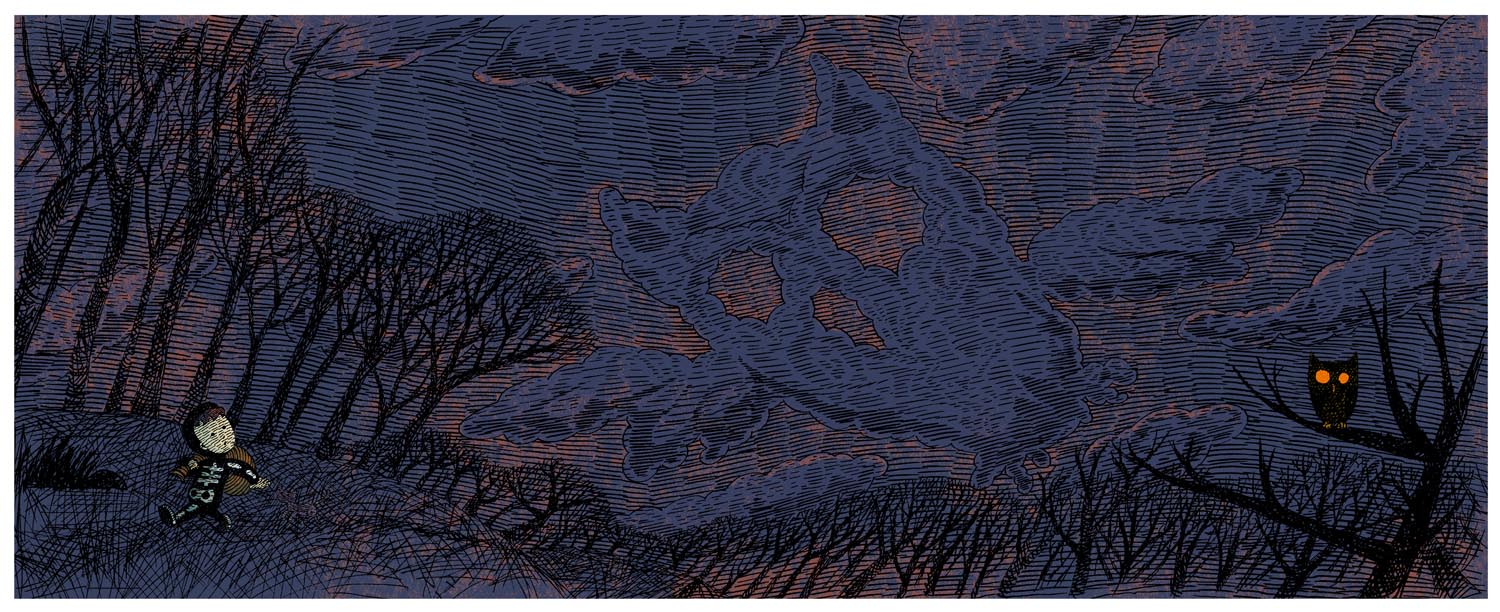
Here is the final sketch for on of the pages from the book. I hired my sister to transfer the images to paper that was close in texture to the sketchbook paper I had been experimenting with in the sketchbooks. I then inked the lines with chisel edge pen. Below shows the final line art and process of adding the color. I can't say how it works exactly as it was an accident I stumbled upon while playing around in Photoshop but everyone was really pleased with the result and it really helps set the mood for the story.
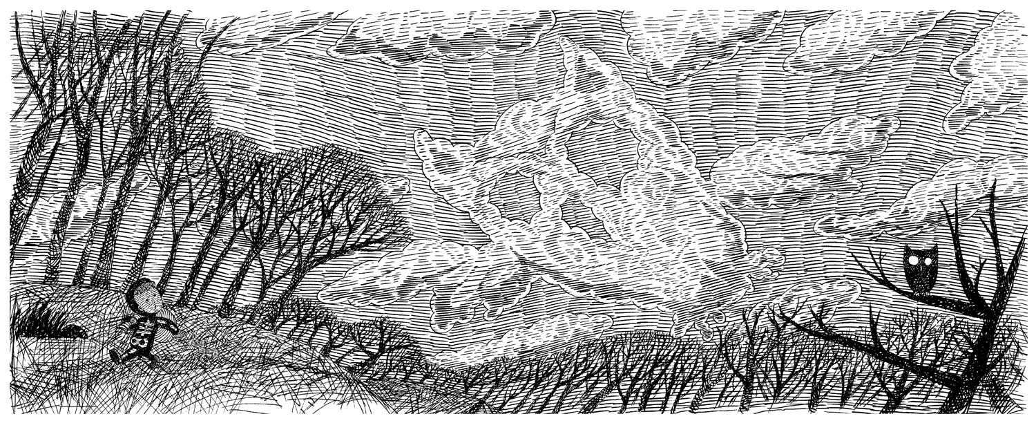
Final line art. About half the size of the final color file. Approximately 18"x7".

The line art is blown up to about 27"x11" and the first layer of color is added. For some reason the first layer is brown with some adjustments for various elements.
The next layer has the texture and main color which is actually a very bright cyan before a filter is applied.

The previous layer is simply floated on top of itself and the image becomes brighter.Here there are some adjustments to various elements like the clouds and boy.

Once more the layer is floated on top of itself, the image get's even brighter and it's finished. This is the final image that was sent to the printer. As with the original experiment with the owl above I loved the final look of the technique but it did take some time to figure out how to get it to function consistently. The final technique reminds me of under-painting and glazing techniques in oil painting.
About the book
On a windy Halloween night, as a little boy makes his way home after trick-or-treating, he hears a voice:
“Cracklety-clack, bones in a sack. They could be yours—if you look back.” As his heart flip-flops with fear, the boy dashes through woods and fields that seem full of haunting shapes—owls, ghosts, skeletons, and more. The detailed illustrations are packed with visual tricks for children to discover. Are those skeletons or cornstalks? Ghostly hands or tree branches? The playful tone of the text makes this a perfect, not-too-scary read-aloud, with an enjoyable surprise ending.

About the author
Nancy Raines Day is a celebrated children’s-book author. She lives in St. Simons Island, Georgia. Read more about her at www.nancyrainesday.com.
George Bates is the illustrator of Abrams’s Chicken Bedtime Is Really Early. He lives in Brooklyn, New York. Visit him online at www.georgebatesstudio.com
George Bates is the illustrator of Abrams’s Chicken Bedtime Is Really Early. He lives in Brooklyn, New York. Visit him online at www.georgebatesstudio.com
http://www.abramsbooks.com/Books/On_a_Windy_Night-9780810939004.html


