Tuesday, April 19, 2011

Evolution of the SIDEKICKS Jacket


Batman has Robin, Wonder Woman has Wonder Girl, and Phantom Justice has Bright Boy, a.k.a. Scott Hutchinson, an ordinary schoolkid by day and a superfast, superstrong sidekick by night, fighting loyally next to his hero.

But after an embarrassing incident involving his too-tight spandex costume, plus some signs that Phantom Justice may not be the good guy he pretends to be, Scott begins to question his role. With the help of a fellow sidekick, once his nemesis, Scott must decide if growing up means being loyal or stepping boldly to the center of things.


Sidekicks, here is a project that I thought would be easy. After all its comics related and I spent a good portion of my high school career face down in them (nerd!). So this should be a no brainer! Wrong. The problem turned out to be I was thinking to much. Stupid me. Here is a little tale of the Sidekicks cover.

After seeing Kick-Ass I really wanted this book to have a similar design approach. If not just totally ripping off the branding. Horrible to admit but true. My admiration would be followed soon with problems.


Only difference we didn't have actors so I enlisted Greg Horn to start work on sketches of our hero. Greg had just finished work on Jack's other book The Big Splash which was now in paperback. ( For more on the evolution of The Big Splash in hard cover by Nathan Fox click here)


Below are the samples of Greg's work that won me over.


In Greg's first sketches we wanted to show a close up like the Kick-Ass posters but show be able to show the idea of puberty which our characters are battling through out the story.

With more detail . . .
. . . angrier . . . more braces!

A quick type sample for a sales meeting


After several meeting we were approved to go to final.

However, something was working. Was the Kick-Ass idea not translating? Yep! Just goes to show you when something works it might not work again in another context.

In a desperate attempt to save Greg Horn's fantastic painting. I started playing around with out compositions and type placements. As you can see the type is very rough. At this stage I will place rough type in to just get a since of composition. Later I will go in a finalize the look of the type.


A comment kept coming up that seeing the both Sidekicks was desired. But now what was this cover about? There seemed to be to much going on.


I moved the character in black (Monkeywrench) to the back cover and concentrated on making the cover work with just Bright Boy. The idea here is secret identity revealed.


But turns out this idea was also to busy. Even though I was really into the type layout.

Here are simpler composition, yet none really say anything about the book


Galley cover design


At this point we decide to start from scratch and enlist our old friend Joshua Middleton ( who illustrated the Jacket of the Unknowns) for help. Our new approach was how to show that he was a sidekick. Joshua immediately sent us sketches.

In the hero's shadow.


This approach like everything before was to conceptual. And in the end we just wanted a cover that was action packed. Like I do on many covers I wanted the type to be part of the illustration.

I asked Josh to have Bright Boy kicking the type. These are his takes on that suggestion.


Nice, but too much crotch.


Like every good superhero you need good branding. What to do with a lightning bolt symbol that Shazam and the Flash won't send there crack pot team of copyright layers after us. below is what we came up with


At this point we started going back to the idea of both Sidekicks on the cover. After all the title is SIDEKICKS plural.


Still to0 much crotch!


Now with less crotch!


Here is Joshua's color sketch
At this stage everything is coming together. Except the type.


Better but missing the author's name Do'h!


Full jacket design


Spot Gloss layer ( all the areas in black are gloss)


Case design


About the book
Batman has Robin, Wonder Woman has Wonder Girl, and Phantom Justice has Bright Boy, a.k.a. Scott Hutchinson, an ordinary schoolkid by day and a superfast, superstrong sidekick by night, fighting loyally next to his hero.

But after an embarrassing incident involving his too-tight spandex costume, plus some signs that Phantom Justice may not be the good guy he pretends to be, Scott begins to question his role. With the help of a fellow sidekick, once his nemesis, Scott must decide if growing up means being loyal or stepping boldly to the center of things.

Praise for Sidekicks
*STARRED REIVEW*
“Scott’s present-tense narration keeps pedal to the metal from start to finish, and readers will be quickly won over as the two super-strong, super-fast, super-likable protagonists face both inner conflicts and a Dark Knight–ish villain as deeply psychotic and scary as he is super powerful. Look for more twists than a pretzel factory and a possible sequel.” –Kirkus Reviews, starred review

*STARRED REVIEW*
“A delightfully clever take on superheroes with this unpredictable adventure. Engaging territory as Ferraiolo reveals the story’s true depths.” –Publishers Weekly, starred review

“An exciting, lightning-paced superhero plot that is also a thoughtful examination of superheroism.”
–The Bulletin of the Center for Children’s Books

“Ferraiolo starts the cape-flying action right from the opening pages. Ferraiolo is delightfully unafraid to inject irreverence into the superhero formula, adding plenty of humor to the high adventure high jinks.”
–Booklist

Jack D. Ferraiolo is the author of The Big Splash. He grew up in southern Connecticut and lives in northern Massachusetts. As the head of development at a children’s animation production company, he has developed and writes for WordGirl on PBS, for which he won an Emmy. Visit him online at www.jackferraiolo.com.


Authors: By Jack D. Ferraiolo
Imprint: Amulet Books
ISBN: 0-8109-9803-3
EAN: 9780810998032
Availability: In Stock
Publishing Date: 5/1/2011
Trim Size: 5 1/2 x 8 1/4
Page Count: 320
Cover: Hardcover with jacket

Coming soon!

Sunday, April 17, 2011

∞ Quote of the Day:

...that which we are, we are;
One equal temper of heroic hearts,
Made weak by time and fate, but strong in will
To strive, to seek, to find, and not to yield.

—This is a quotation from Alfred Lord Tennyson's poem Ulysses

Tuesday, April 12, 2011

∞ Quote of the Day:

∞ Quote of the Day: Mike Tyson - The Brooks Review
“Everyone has a plan until they get punched in the face.”
— Mike Tyson

Thursday, April 07, 2011

The Strange Case of Origami Yoda *WINNER* of the E.B. White Read-Aloud Award


The Strange Case of Origami Yoda

is the *WINNER* of the E.B. White Read-Aloud Award for the Middle Reader category!!!


This award is voted on by the booksellers of IndieBound across the country!

The E.B. White Read-Aloud Awards recognize books that reflect the playful, well-paced language, the engaging themes,

and the universal appeal to a wide range of ages.

They will honor the winners during the ABA Celebration of Bookselling Luncheon during BookExpo this May.

The author, Tom Angleberger, will be in attendance to accept his award.

http://news.bookweb.org/news/aba-announces-2011-indies-choice-and-eb-white-award-winners

Share this fabulous news with everyone, you must.

What I did today.

Lettering—For Peter Nimble and His Fantastic Eyes sub title

Wednesday, April 06, 2011

Out with my ladies at the Eddie Trunk Book Release Party

Friday, April 01, 2011

Zach Gordon aka the Wimpy Kid at my desk

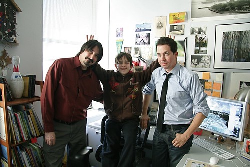
Charles Kochman(editor), Zach Gordon(actor), Chad W. Beckerman(art director)

Sunday, March 27, 2011

Jacket and Case


In an age when books as objects are being thrown into question It is now more than ever that a designer should think of a book as a complete package. I believe very strongly that all the elements of a book from the interior to the case should appear that they belong together with each other. Seems like a no brainer. But there are many reasons why this might not happen. Costs, multiply designers, time, what ever it may be its always makes a book feel special when everything is considered. Here are a few books we have worked on. These show the Jacket and case.


Friday, February 18, 2011

DARTH PAPER STRIKES BACK


This morning Susan Van Metre presented DARTH PAPER STRIKES BACK at our Pre-Sales conference. I helped by wearing my cousin Jamie's Darth Vader mask to help plug the book new book to our sales force. Before however Susan and I had a bit of fun. Thought you’d like to see.


Wednesday, February 09, 2011

Drawing

Sometime ago I came across Greg Ruth's 52 weeks drawings series where he produced a drawing a week on any subject matter that he wanted. Not an easy task by any means. I tried to to a drawing a day a few summers ago. I lasted a valiant 2-3 months. During those couple of months I began to post the drawing I produced on a blog. It wasn't my intention really for anyone to see them but rather just to have a place to showcase them and let them go and move on to the next drawing. This process inspire me to become immersed in actually producing new material. As an illustration major and for a very brief time a freelance illustrator that hardest thing in the world to do is keep your self immersed in your work when the world wants you to survive. There is no one telling you (besides yourself ) to draw, paint, etc. As I posted a drawing a day it kept myself empowered to do more work and for 2-3 months it worked. I once again am trying to get back into a regiment. This time I am going to dial it back to a drawing a month. Seemed to work for Greg Ruth.

Wednesday, February 02, 2011

Sunday, January 23, 2011

George Bates discusses his process


"The story is written by Nancy Raines Day and basically tells the tale of a boy traveling through the woods alone on Halloween night as he becomes frightened by what may, or may not, be lurking in the woods and following him home. The manuscript was really an illustrator's paradise as the story of a boy who's imagination may be running wild really lends itself to a very wide visual interpretation. I decided I wanted to try to get the viewer's experience as close as possible to that of the boy in the story's. That being, the experience of things being a little off balance as to the nature of reality. Around the that I was offered the story I had recently been hired to do a job that required crosshatching and thought that approach would lend itself well to seeing things and forms that may be vague and not quite there and set to experiment with the ideas, technique and compositions in my sketchbook."—George Bates

In fall of 2010 On a Windy Night was published. Below is a bit of a glimpse into the process that Illustrator George Bates went through.


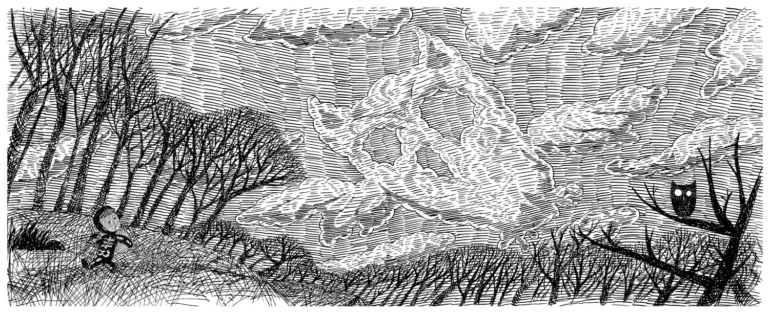
Here is the first drawing I played with in my sketchbook. I created the original drawing rather small and enlarged it for the final art so that the hatching marks and line quality has an even rougher look to help with the mood of the story.


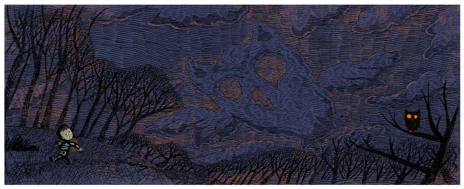
This is the color image I submitted to Abrams and Nancy to get signed off on the look and feel of the illustrations. The final color image is an accident that I stumbled upon while playing with layers and textures in Photoshop. I thought that the technique helps the idea of the book by visually confusing the depth of the picture plane.


Here are some sketchbook explorations of the boy character in the book and some rough storyboard sketches. The boy is based on a photo I have of my younger brother who loved Halloween much more than I ever did.


Working on children's books is an extremely collaborative endeavor in terms of choosing and refining the best rythm, pacing, tone and marriage of text and image. Above are some of the first round of storyboards for the ending of the book that just didn't work. In total I think we did three passes of storyboards before settling on a final version. These didn't work because it shows the boy at that height of his fright and in these sketches he clearly leaves reality altogether into madness...not quite right for the age group. From the beginning of the sketching process the challenge was to find the right balance of scary and cute and i think we nailed it in the end. A favorite Maurice Sendak quote I love is "you can't frighten children, they are already frightened...". However, you can traumatize them and we wanted to steer clear of that. I thought it was interesting though that a friend who is a children's librarian told me many children come into the library requesting scary books and often claim the books they receive are not quite scary enough.

Another significant difference between these original storyboards and the final version of the book is that here in the first pass it was decided that each page would be a spread so as to lend the book a more cinematic quality and deepen the reader's immersion each page and the story. I thought this worked out beautifully as a child who had recently read the book exclaimed " that's the best movie I ever read!".


Here is the final sketch for on of the pages from the book. I hired my sister to transfer the images to paper that was close in texture to the sketchbook paper I had been experimenting with in the sketchbooks. I then inked the lines with chisel edge pen. Below shows the final line art and process of adding the color. I can't say how it works exactly as it was an accident I stumbled upon while playing around in Photoshop but everyone was really pleased with the result and it really helps set the mood for the story.


Final line art. About half the size of the final color file. Approximately 18"x7".


The line art is blown up to about 27"x11" and the first layer of color is added. For some reason the first layer is brown with some adjustments for various elements.


The next layer has the texture and main color which is actually a very bright cyan before a filter is applied.


The previous layer is simply floated on top of itself and the image becomes brighter.Here there are some adjustments to various elements like the clouds and boy.


Once more the layer is floated on top of itself, the image get's even brighter and it's finished. This is the final image that was sent to the printer. As with the original experiment with the owl above I loved the final look of the technique but it did take some time to figure out how to get it to function consistently. The final technique reminds me of under-painting and glazing techniques in oil painting.


About the book
On a windy Halloween night, as a little boy makes his way home after trick-or-treating, he hears a voice:

“Cracklety-clack, bones in a sack. They could be yours—if you look back.” As his heart flip-flops with fear, the boy dashes through woods and fields that seem full of haunting shapes—owls, ghosts, skeletons, and more. The detailed illustrations are packed with visual tricks for children to discover. Are those skeletons or cornstalks? Ghostly hands or tree branches? The playful tone of the text makes this a perfect, not-too-scary read-aloud, with an enjoyable surprise ending.


About the author
Nancy Raines Day is a celebrated children’s-book author. She lives in St. Simons Island, Georgia. Read more about her at www.nancyrainesday.com.

George Bates is the illustrator of Abrams’s Chicken Bedtime Is Really Early. He lives in Brooklyn, New York. Visit him online at www.georgebatesstudio.com


http://www.abramsbooks.com/Books/On_a_Windy_Night-9780810939004.html

Friday, January 21, 2011


I know, I know. I have been missing way to long. I need new content. Oh me. Alright I'll get to it, I promise. Right after we stop celebrating HEART OF A SAMURAI winning a Newbery Honor.