"I imagine people will be surprised at how much work goes into this type of project. I'm surprised, and I participated in it!" —Ethen Beavers
Step one find an Illustrator.
To find the perfect illustrator I teamed up with Michael and headed down to our local comic store, Rocketship (sadly, now closed) on a cold January afternoon. We shifted through comics and graphic novels , compiling a list of ten names that we would present to our editor Susan Van Metre. In the end Ethen Beavers was the nerd for us. I tracked Ethen down by leaving a message on his art message board since all other searches came up flat. He responded which was a welcomed surprise.I then sent him Michael's 2nd draft manuscript and a brief summary.
NERDS book description:
A secret spy ring of nerdy elementary school misfits
Combining all the excitement of international espionage and all the awkwardness of elementary school, NERDS, featuring a group of unpopular students who run a spy network from inside their school, hits the mark. With the help of cutting-edge science, their nerdy qualities are enhanced and transformed into incredible abilities! They battle the Hyena, a former junior beauty pageant contestant turned assassin, and an array of James Bond–style villains, each with an evil plan more diabolical and more ridiculous than the last.
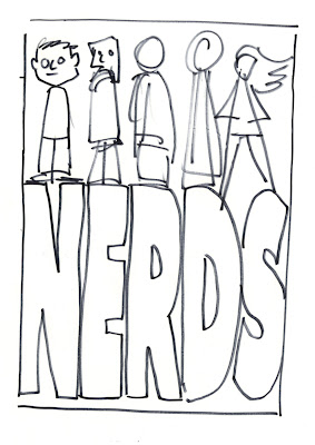
Ethen's first sketch

My first alternate compositional sketch. The idea was to introduce the all the characters.

Here the idea is the same but a little more realized. We added braces in the type. I add to a nerdy style as well as to highlight the main characters nerdy quality. This would be repeated through out the series. Only there was something still not quite working.


We where forgetting the Spy angle to the NERDS story.
here are some additional sketches working out new compositions

The idea of and official seal came up.
Finally a font was chosen
Here we begin to work out color and how it will be used throughout a 6 book series

Next how to treat the type. I wanted a techie feel to the type as seen below.

Final type

But the seal still is working correctly. So we tried to nerd that up as well.
In the end it proved to be to much.

Again we needed more spy imagery. So we research James Bond and Mission Impossible imagery.
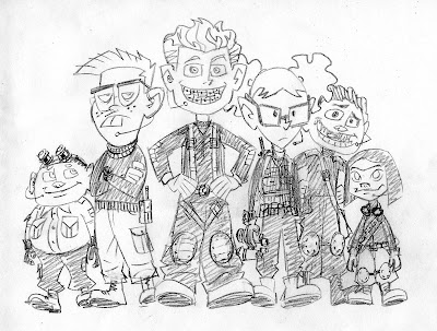
Ethen worked up these great sketches reworking the characters.


Ethen then combined the two ideas in to a final sketch

Then we took it to a cover meeting to see if we were on track.
Turns out we were!
Final art with out text.
Final Cover with text
Back cover design
Each book features a character. Book 1 features Jackson " Braceface" Jones, the new recruit. The fourteen pounds of metal in his mouth make him the team's go-to gadget guy!
One last bit a of business the CASE COVER!
Did you know we designed the case covers for NERDS series with a different image than the jacket. I knew it you didn't. Who looks at the case cover anyway. GULP! I do.

Case Cover


Also in the NERDS series
About the book
Michael Buckley is at his comic best in this madcap new series sure to appeal to kids looking for a quick, exciting read.
Combining all the excitement of international espionage and all the awkwardness of elementary school, NERDS, featuring a group of unpopular students who run a spy network from inside their school, hits the mark. With the help of cutting-edge science, their nerdy qualities are enhanced and transformed into incredible abilities! They battle the Hyena, a former junior beauty pageant contestant turned assassin, and an array of James Bond–style villains, each with an evil plan more diabolical and more ridiculous than the last.
F&P level: V
Praise for NERDS
“An action-packed, tongue-in-cheek take on the world of superheroes and villains. The pacing is quick and the action is plentiful—kids will almost hear the sound effects as they read. NERDS brings a worthy message to the fore—that uncool kids can grow up to be anything but. Funny, clever, and thoroughly entertaining, this title should be popular.”
–School Library Journal
"The unique format of this book, combined with the imaginative and playful storyline, will appeal to many readers."
–Children's Literature
About the author
Michael Buckley is the author of the New York Times bestselling series and Today Show Al Roker Book Club pick The Sisters Grimm. He has also written and developed shows for Nickelodeon, Disney, MTV Animation, the Sci- Fi Channel, the Discovery Channel, and VH1. He lives in Brooklyn with his wife, Alison, and son, Finn.


11 comments:
Wow! I love to see the process like this! And it turned out great. Can't wait to read it.
It was great seeing the process and the minute variations from cover to cover, and then the giant leaps as direction changes came in. It seems that we could apply the same principles to editing a draft. Small changes followed by giant sweeps as ideas transform, followed by more fine tuning. Thanks for sharing this.
It was a long road but I think we got something nice. I have a good feeling about this book.
I love posts about process. It's so interesting how changes come about and how projects evolve. Thanks for sharing :)
Thanks so much for sharing, that was very interesting! Great cover.
That is a great cover! ...And now I want to read the books. =)
I'm not just saying it but the book is great. The interior illustrations alone are amazing!
Thank you so much for sharing the process. I'm a MFA student and always appreciate a look at efforts required to make books happen.
Love these books. I noticed that first, the kids looked like they were maybe thriteen to fifteen, and were slightly less...well...nerdy! Also, in the next generations, all up until the final, Ruby (the one with the pigtails) looked more brooding than intense and angry (as she is--don't believe me? read the books!). I'm glad you changed it. These are so cool!
Thanks so much for sharing the the evolution of ideas and sketches that resulted in a sharp final cover!
I have the one with the first illustration without the James Bond style and I have tied to look everywhere on the internet and I cannot find on like this. How many copies if you know went out with this first cover design?
Thank you
Post a Comment