
About the book
Peter Nimble and His Fantastic Eyes is the utterly beguiling tale of a ten-year-old blind orphan who has been schooled in a life of thievery. One fateful afternoon, he steals a box from a mysterious traveling haberdasher—a box that contains three pairs of magical eyes. When he tries the first pair, he is instantly transported to a hidden island where he is presented with a special quest: to travel to the dangerous Vanished Kingdom and rescue a people in need. Along with his loyal sidekick—a knight who has been turned into an unfortunate combination of horse and cat—and the magic eyes, he embarks on an unforgettable, swashbuckling adventure to discover his true destiny

Now, for those of you who know anything about blind children, you are aware that they make the very best thieves. As you can well imagine, blind children have incredible senses of smell, and they can tell what lies behind a locked door—be it fine cloth, gold, or peanut brittle—at fifty paces. Moreover, their fingers are small enough to slip right through keyholes, and their ears keen enough to detect the faintest clicks and clacks of every moving part inside even the most complicated lock. Of course, the age of great thievery has long since passed; today there are few child-thieves left, blind or otherwise. At one time, however, the world was simply thick with them. This is the story of the greatest thief who ever lived. His name, as you’ve probably guessed, is Peter Nimble.—JONATHAN AUXIER
First step hire an amazing illustrator that will bring something fresh to the project. His name Gilbert Ford! Gilbert and I had just finished the cover of Tom Angleberger's Horton Halfpott so I was well aware of his talents. While working on Horton, Gilbert punched out a bunch of ideas right on the first go around this time was no different. I had an idea working in my head but I wanted to see what Gilbert came up with first. No reason.
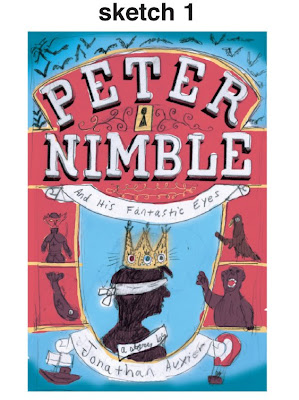
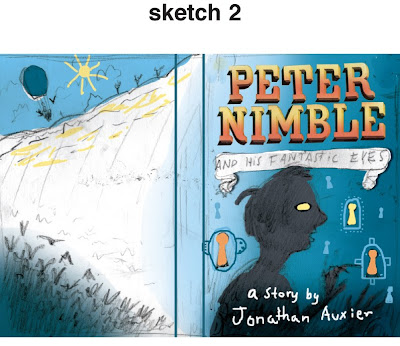
Below are Gilbert first round of sketches and his explanation behind each idea.

This has peter nimble blindfolded, representing blind, and a crown on his head. On each jewel shows one of the three different pairs of eyeballs. This represents the jeweled eyes in his crown that gives him power. It also alludes to him being a prince. The characters are Sir Tode, Simon, one of the apes, and Frederick the fish. At the bottom is the ship and the air balloon the cat and raven ride. The back cover would be done in a similar fashion to the front, making room for bar code and text.

This plays with the idea of turning the silhouette of the boy's eye into a die-cut. I was also thinking that the keyholes could be die cut. I thought that the two symbols of a lock and eyes could be used like they are linked together. On the back are the ravens, which turns to sky and sand and then the hot air balloon over the desert. Room for text in the white area. Not sure if the type should be treated differently.

The keyholes are literally his eyes (since they are holes, too, having no eyes) but also the holes represent both his talent and his weakness, and opening new doors- his fantastic eyes can take him places. In the decorations around the border are the literal eyeballs. I am wondering if they should just be gold so that you don't see that they are eyeballs immediately. I was thinking of just treating the boy in dark blues so that if you want to make the key holes into a die cut, it will show up.

The E's in peter are eyes. The silhouettes of the boy shows him looking and there is a color radiating out as if it takes him to another dimension.


 But still the idea of a die-cut was just not working with the design or the story. I was missing out on the fantastic setting an world of the story that needed to be shown on the cover so the read could be identify and hopefully be sucked into the world of the book as I was from the first paragraph.


 The last thing left to do is pic the color for the case. You want to try and match the colors of the jacket to the case. There are a few different was one can go. And for some reason the easiest part of book design always make me sweat a little. Did I pick the right colors?


21 comments:
GORGEOUS!! And that case is amazing as well with the green on green.
What a beautiful book! It looks awesome, thank you for sharing the process!
What a beautiful cover! It looks awesome! Thank you for sharing the process!
Dang, you guys really went ALL OUT here! Looks awesome.
I am drooling over your type!!!! this is simply exquisite design! ;)
love it!
Thank you for taking the time to assemble and post such an informative blog post. The book looks amazing and obviously worth all the extra effort that was taken.
Simply gorgeous. Thanks for sharing.
Beautiful work, I love seeing how much care was put into every element. Awesome!
can only be described in one word: fantastic!
can only be described in one word: fantastic!
Beautiful job Chad. Love seeing the process. Kudos to the iller too.
Tim O'Brien
wow, it's so lovely! thank you for sharing your process.
So complete, and so well thought. Bravo Gilbert and Chad!
I really liked the article, and the very cool blog
I love the various sketches you went through to get to the final. All that hard work was well worth the genius cover! :D I'll definitely be sure to look more into the book!
Wow! I just loved this :) Great work.
OH MY GOD this is so beautiful! We really need this in Argentina!!! I WANT IT haha
Thanks for this post! It's great to see the many drafts and the evolution! Great outcome!
Brilliant sounding kids book - and what a cool cover. The evolutionary/iterative process reveals just how much work it takes to get a good cover. My sister does kids' book illustrations, in the Netherlands, and is always busy. Thanks for sharing.
Matthew Wright
http://mjwrightnz.wordpress.com
www.matthewwright.net
Beautiful job! Absolutely amazing!
That looks fantastic! Quite a difference between the initial concepts and the final cover. What company did you go through for the hardcover print?
Post a Comment