A first in a purposed series of interviews from MISHAPS AND ADVENTURES talking with illustrators and authors. We will talk about their process and how they found there way into children's books.


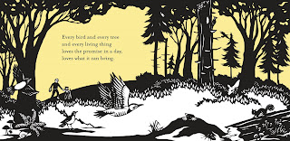
To lead off this series I have interviewed Nikki McClure. Nikki is a self-taught artist who has been making paper-cuts since 1996. Armed with an X-acto knife, she cuts out her images from a single sheet of paper and creates a bold language that translates the complex poetry of motherhood, nature, and activism into a simple and endearing picture. She regularly produces her own posters, books, cards, t-shirts and a beloved yearly calendar as well as designs covers for countless records and books, including illustrations for magazines the Progressive and Punk Planet. She is the author and illustrator of Abrams’ Collect Raindrops. ALL IN A DAY is her first Abrams’ children’s book.

CW: Hi Nikki. Welcome to Mishaps and Adventures
first ever interview
NM: Very Exciting! Let's begin.

CW:Where did you grow up and where do you live now?
NM: I am a Puget Sounder. I grew up in Kirkland and then m oved to Olympia to go to college. Now I live on a hill in town with 30 fruiting trees planted. I am rooted here.
CW: What is your educational background? What courses or
training might be helpful in beginning a career in illustration?
NM: My Background is in Natural Sciences. I received my B.S. and stayed an extra year to get a B.A. but my art focus was Natural History Writing. I didn't make my first foray into the Art building until my last quarter to print linocuts I had made for a book about wetlands. Even though I didn't take any art classes, I now see that time spent drawing plants and flies as training my eye to see and my hand to respond. Training? Just begin! Don't wait to be "chosen". I illustrated the Brother's Grimm stories, not waiting for a publi sher to ask me. I published my own books at Kinko's and hand-colored them in. The work I do now is inspired by WPA posters. I am not waiting for the government to start funding a new poster series, I'm just making them myself. Less compromises that way. Making mistakes is the best way to learn.
NM: The first book I made was "Wetlands". I felt there wasn't anything out there for grade schoolers' to understand wetlands. So I made it. I received a grant and rented a studio for $50 a month (!!!!) Put a desk, chair, and iron in it and started making linocuts all day (K Records was next door so I could just listen to the music they were playing). It is still published by the Wa. State Dept. of Ecology. I enjoyed exploring the motion of the book, examining how a book is read, how the images progress. I get really happy when I am making a book and little pieces start appearing in the images. Tiny stories start developing no matter how well planned. I like being open to the evolution of the book. Plus the smell of a freshly printed book is so delicious!
CW: What are some of your favorite books for children?
NM: Well. here are my favorites right now—I love having a child so I can read books all day long!
 the Willows—I could read that book forever. I am often Mole and my son is Ratty.
I get rescued from the Wild Wood weekly.
2. The Moomin series by Tove Jannson—Finland, naked trolls, Snufkin. I would stare at the pictures when I was a child. She drew full moons so beautifully.
3. The Swallows and Amazons series—the world as children imagine it.
4. The Jungle Book—never let children watch the Disney version! It will ruin their minds.
5. The Animal Family—a perfect family
6. Where the Wild Things Are—even the paper feels good
Anything that Maurice Sendak touched.
7. Dawn
8. Winne the Pooh
There really are so many. Piles of good books are just behind me.
CW: Who are your artistic influences?
NM: Sendak, Jannson, Kathe Kollowitz, Frans Masreel, Lynd Ward, as well as mushroom gills, rain, pine needles on snow, leaf stains on sidewalks, chickadees, apple blossoms, and my family.
CW: ALL IN A DAY is your third children's book and the first book we worked together on. Can you describe your creative process?
And how you approached the challenges of this particular book?
And how you approached the challenges of this particular book?
NM: It might be my 7th—but it is my first published by someone other than myself. It has also been a long time since I used someone else's words as inspiration for images.
I read the text over and over, memorizing it, internalizing it, reading it to Finn (my 4 year old), reading it to friends. I then made sketches and talked about these with Susan, my editor. Susan and you had ideas too—we went back and forth with many ideas ditched and new ones drawn up. This part was really hard for me,but now I am thankful for the critique and challenges to push more out of the story. The text was challenging as it provided no character, no scene, no place, nothing but emotion. I was intimidated a bit by Cynthia being a NEWBERY MEDAL WINNER! and here I was making a narrative story with my images to her celebrated words. I had to remind myself that she wrote the words with my images in mind, and that this is what illustrators did. So I relaxed, wrote "Have fun" on my wall (a parting quote from Susan Van Metre our editor) and went at it. Once I got the final go ahead, it really felt great to race ahead. I felt like a horse at full gallop. The easy part was making the artwork! I'm not one to storyboard my own work. I usually just let the story evolve. But all the planning paid off in the end. I could just make the pictures. I just had to make the characters look the same throughout. I used clothing to help disguise the fact that I am not a portraitist. Remember my work is with x-acto knife, so it is hard to erase and redraw until the nose ids just the same as in the last picture.
I read the text over and over, memorizing it, internalizing it, reading it to Finn (my 4 year old), reading it to friends. I then made sketches and talked about these with Susan, my editor. Susan and you had ideas too—we went back and forth with many ideas ditched and new ones drawn up. This part was really hard for me,but now I am thankful for the critique and challenges to push more out of the story. The text was challenging as it provided no character, no scene, no place, nothing but emotion. I was intimidated a bit by Cynthia being a NEWBERY MEDAL WINNER! and here I was making a narrative story with my images to her celebrated words. I had to remind myself that she wrote the words with my images in mind, and that this is what illustrators did. So I relaxed, wrote "Have fun" on my wall (a parting quote from Susan Van Metre our editor) and went at it. Once I got the final go ahead, it really felt great to race ahead. I felt like a horse at full gallop. The easy part was making the artwork! I'm not one to storyboard my own work. I usually just let the story evolve. But all the planning paid off in the end. I could just make the pictures. I just had to make the characters look the same throughout. I used clothing to help disguise the fact that I am not a portraitist. Remember my work is with x-acto knife, so it is hard to erase and redraw until the nose ids just the same as in the last picture.

CW: The use of color in ALL IN DAY and in much of your
art is minimalistic. How do you make decisions about color?
art is minimalistic. How do you make decisions about color?
NM: When color is added to my work, I ask "Why is that colored in? What make that object so important?" Color is distracting to me. I like things black and white. I was asked to add more color in ALL IN A DAY after all the images were done. BY then, all decisions about value- dark/light had been made. To add color would have unbalanced the images, to me. I suggested alternating the background color from blue to yellow to blue . . . The use of color subtly interacts with the story and enhances it rather than being color used as decoration (make his shirt yellow with red polka dots).
My next book uses a lot of color, for me. Each color is added as the story develops.
CW: What did you find to be the toughest and most rewarding
aspects of your work on ALL IN A DAY?
aspects of your work on ALL IN A DAY?
NM: The redrawing, the redrawing, the redrawing . . . I used up a lot of pencil lead and erasers. It was also the most rewarding. When it came time to make the real art, the hard part was already done!
CW: I have noticed recurring themes of nature, cooperation,
and enjoyment of the outdoors in your work. Does your work
have a particular message? What do you hope people
take away from your images?
and enjoyment of the outdoors in your work. Does your work
have a particular message? What do you hope people
take away from your images?
NM: If they take away those things, then great! I want my work to resonate with a deep collective memory of fingers in soil, growing food, talking to birds (not just listening), people working together in community. Some people do this everyday, but some people are in cities where the soil is deeply buried and the human noise drowns out bird voices. What is human nature? Cities aren't unnatural, but more can be done to encourage cooperation. I'm just trying to help recall a memory of that.
CW: You have built a strong local following through your cards
and calendars. What advice would you give an illustrator who
is just getting started? What are some ways she can get his or
her name and work out into the world?
and calendars. What advice would you give an illustrator who
is just getting started? What are some ways she can get his or
her name and work out into the world?

NM: Share your work: Make it. Show it. Give it. Your work needs to be in the world. I donate my images to non-profits to use as holiday/thank you cards. The calendar has been great. I call it my spores. They get sent all over to people who don't know my work. They hang it up in their office or kitchen ( I love being in kitchens everywhere) and all those people who visit them see it- then they all want one next year, and so on. Better than viral marketing- spore marketing is more symbiotic. It has ended up next to the desks of designers and they in turn have called me. I didn't have to send out my p ortfolio. I did drop off my portfolio once at The New Yorker. They only use a half-sheet of paper when they politely decline. I should send them a calendar I suppose.
 ortfolio. I did drop off my portfolio once at The New Yorker. They only use a half-sheet of paper when they politely decline. I should send them a calendar I suppose.
CW: What are your working on now?
NM: I have just started the final artwork for my next book with Abrams, MAMA, IS IT SUMMER YET? I'm in the gallop ahead stage. I will finish the image of gathering sticks today. I added loppers- so they are pruning the apple tree and the child has so many sticks in his arms that some are falling away. (I'd send you a pic of the sketch, but someone stole our camera in Hawaii and I am waiting for a new one to be delivered). I am also thinking of the 2010 calendar images, title, theme . . . . Today will will also send out valentines Finn printed on the printing press but we have to get stamps= a Big Day
CW: What is your idea of a perfect day?
NM: Today (minus typing a computer interview, sorry!)
The fog has lifted and the sun is out. Snow is melting and the green is so green and the blue so blue. I will finish a picture today. I might bake cake or at least make a pie. Secret Valentines will be mailed. There will be some slushy snowball throwing. Perhaps I will be rescued from the Wild Wood. Dinner at a friend's house who always cooks so beautifully and where we will read old Peanuts cartoons. Back home I will take a very hot bath. Then read a great book with a cuddly child and dream.
The fog has lifted and the sun is out. Snow is melting and the green is so green and the blue so blue. I will finish a picture today. I might bake cake or at least make a pie. Secret Valentines will be mailed. There will be some slushy snowball throwing. Perhaps I will be rescued from the Wild Wood. Dinner at a friend's house who always cooks so beautifully and where we will read old Peanuts cartoons. Back home I will take a very hot bath. Then read a great book with a cuddly child and dream.
http://www.nikkimcclure.com
BUY ALL IN A DAY!
BUY ALL IN A DAY!
ISBN: 0-8109-8321-4
EAN: 9780810000000
Hardcover with jacket
US $17.95
Availability: Preorder (available in February 2009)
US $17.95
Availability: Preorder (available in February 2009)


3 comments:
I love her work, so clean and dynamic, it's amazing that those are all cut-outs! Very nice.
What she says about color reminds me fondly of a book of Shaker furniture I was flipping through recently.
Those are beautiful black and white illustration !
Demetri from t-shirt personnalisé
Post a Comment