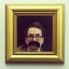
Me Earl and the Dying Girl is the funniest book I have read this year. And when I say book I don't just mean young adult, I mean adult books as well. Just to be clear. This is why I knew I needed to find someone who had the whit and edginess that Jesse Andrews put into the story to design the cover. That lucky man turned out to be Ben Wiseman. Ben up until recently had only designed book covers for adult books. An impressive list of adult titles I might add. Such as...
First let me tell you a little about, Me and Earl and the Dying Girl
Up until senior year, Greg has maintained total social invisibility. He only has one friend, Earl, and together they spend their time—when not playing video games and avoiding Earl’s terrifying brothers— making movies, their own versions of Coppola and Herzog cult classics. Greg would be the first one to tell you his movies are f*@$ing terrible, but he and Earl don’t make them for other people. Until Rachel.Rachel has leukemia, and Greg’s mom gets the genius idea that Greg should befriend her. Against his better judgment and despite his extreme awkwardness, he does. When Rachel decides to stop treatment, Greg and Earl make her a movie, and Greg must abandon invisibility and make a stand. It’s a hilarious, outrageous, and truthful look at death and high school by a prodigiously talented debut author.
July 2011
I had just got of the plane in Austin from New Orleans where I had attended my first ALA in my inbox where Ben first cover design ideas. I gave him little direction as I tend to do in the first go. What I received were 5 very different directions. As an art director you love to see someone who embraces the subject matter and gives you more that just one direction, whether its a illustrator or a designer. It's easier to pull someone back than to have to push them. In Ben's case there was no pushing necessary.
At this point I needed to direct him. To let him know where Maggie Lerhman ( senior editor ) and myself envision what was best for the book.
Here is was Ben gave us.
What we came away with from these comps was Ben's great type. I loved how his hand drawn type capture each characters personalities. But we still where stuck on the image. Since the subject matter was for an older audience we decided to go in a photographic approach.
Again Ben used his type choices to echo the characters. But now dividing the composition into panels to echo the idea of film frames. These ideas were very impressive but still didn't fit into what we were looking for. We wanted something more edgy and gritty, more Pittsburgh than Miami. The stock photography just didn't seem authentic to the characters and fell flat.
From here I gave Ben a few directions that would help him design the cover below, Gritty, Film, DIY, Panels and Drawn figures.
The characters make many films in the book and create sets.
These covers are meant to echo the sets that they created.
Praise for Me and Earl and the Dying Girl
STARRED REVIEW
“One need only look at the chapter titles (“Let’s Just Get This Embarrassing Chapter Out of the Way”) to know that this is one funny book.”
–Booklist, starred review
–Booklist, starred review
STARRED REVIEW
“A frequently hysterical confessional...Debut novelist Andrews succeeds brilliantly in painting a portrait of a kid whose responses to emotional duress are entirely believable and sympathetic, however fiercely he professes his essential crappiness as a human being. Though this novel begs inevitable thematic comparisons to John Green's The Fault in Our Stars (2011), it stands on its own in inventiveness, humor and heart.”
–Kirkus Reviews, starred review
–Kirkus Reviews, starred review
“It is sure to be popular with many boys, including reluctant readers, and will not require much selling on the part of the librarian.”
–VOYA
About the author
Jesse Andrews is a writer, musician, and former German youth hostel receptionist. He is a graduate of Schenley High School and Harvard University and lives in Brooklyn, New York, which is almost as good as Pittsburgh. This is his first novel. Visit him online at www.jesseandrews.com.


1 comment:
fascinating cover evolution. i really dig the back cover that evokes the back of the sets... what a great idea. Book sounds really good too.
Post a Comment